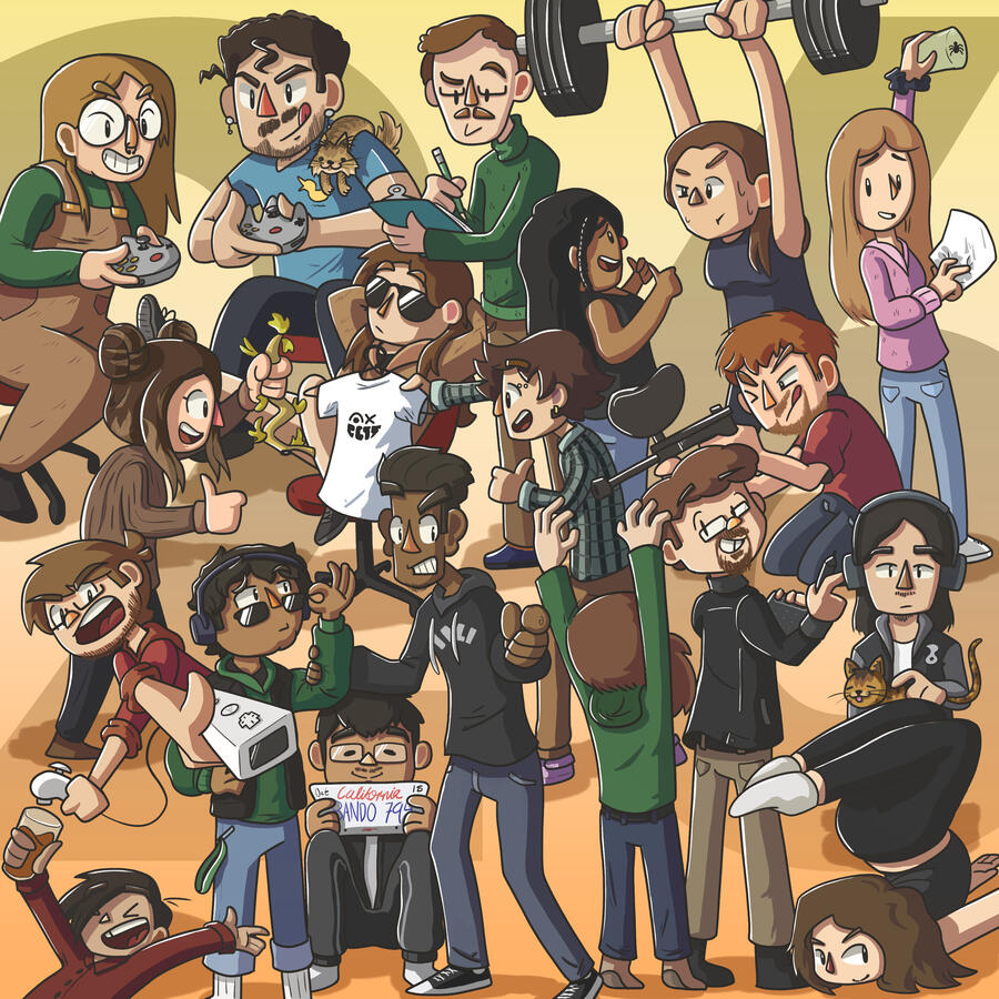
I’m Reese!
Who am I though?
I’m an illustrator, graphic designer, video and audio editor, and many more labels I can’t fit in one text box!


See What I Can Do

Summerland Sweets Package Redesign

Design Victoria Wayfinding


Kenkodachi

Shibuya Punk Type Booklet

VIU Arts & Humanities Cards


Projects

Shibuya Punk Type Booklet


VIU Arts &
Humanities Cards


Summerland Sweets
Package Redesign


Design Victoria Wayfinding

Shibuya Punk Type Booklet
Typography, Layout, Illustration
Challenge
The goal of this project was to create a booklet showcasing a selection of type principles that were important to me as a designer. This booklet was supposed to reflect the tone and aesthetic of my brand. Personality plays a large part in this project so my research was, effectively, figuring out which aspect of my personality or aesthetic I needed to prioritize to showcase the type principles I value most. This is where I decided the best approach was an identity tied to the urban aesthetic of Shibuya Punk: a visual style embodying individualism with an exaggeration of personalization.

Front and back page
Approach
With this in mind, I knew the design needed expressive colours, illustrative visuals, all tied together with a design style I tend to gravitate towards. Shibuya Punk's emphasis on rebellion was a great starting point for conceptualizing and ideating, but it was important to me that I kept a sense of balance and hierarchy to the design. Just because a visual style can look messy, doesn't mean it needs to be messy (the term I prefer is 'imperfect').

'Contrast' spread
My Role
I started with extensive research into Shibuya Punk including its history, purpose, and early implementation. This was the foundation of the project, so games like Jet Set Radio, Splatoon, and Bomb Rush Cyberfunk were my main sources of inspiration. I mostly worked in Illustrator for the illustrative compositions, giving each spread a unique visual identity to differentiate each type principle from the last. Keeping a consistent grid and body copy in the InDesign file brought order into an inherently chaotic visual style.


Summerland Sweets
Package Redesign
Photography, Typography, Layout, Illustration
Challenge
The goal of this project was to choose a local brand of produce or goods and redesign it to the best of my ability. This project was meant to highlight the local, home-made feeling of the original Summerland Sweets jam jar designs. Because this was a redesign and not a rebrand, the target audience remained smaller communities and local stores, but this time trying to tackle a different genre, so to speak.

The first concept sketches for the labels

Flat sheet of the freshly printed labels
Approach
Because Summerland Sweets prides themselves on their heritage and community, this design needed to focus on locality and having that home-made feeling. These jars were cut, glued, and put together by hand to reinforce the handmade aspect of the product. This approach helped solidify the jars as hand-illustrations support the local brand while the rest of the design tips towards professionalism and refinement of the craft, much like the team at Summerland Sweets!

First pass of the jar, gluing the label in place

With the fabric cut, this jar is complete!
My Role
I first started by researching the small company's background, intention, and market to see what their existing brand was already doing. The original jam jars were designed with quite the gourmet look (on their website the product is literally called "Gourmet Jams") which, while refined, felt like it detracted from the home-made feeling they pride themselves with. For this reason, I opted for a more illustrative style as opposed to realism.
This was my first project which involved dimension in the design beyond a box since I knew from the start this would be a cylindrical package. I purchased the jars, measured their height and circumference, then made the artboards relative to those dimensions. They wrapped around perfectly!

The jars stood side by side

The jars bundled together
VIU Faculty of Arts & Humanities Print
Typography, Layout
Challenge
The goal of this project was to create advertising material for VIUs Faculty of Arts & Humanities. With a change in offered programs and courses along with outdated written statements from the chairs of each department, the advertising for the Faculty of Arts & Humanities needed a fresh look and some cleaner representation.

Top down view of the organized cards.

VIU's brand elements I used in this project

Display of the card designs.
Approach
It was clear from the beginning that the client wanted to prioritize clarity over all. This made choosing type size and spacing very important. I planned on achieving a professional look through clean layouts and efficient use of white space. This project needed clarity since it was advertising for a university, so simple typography was a must. This meant utilizing different font weights and sizes to provide that clarity.
My Role
I began the process by researching the brand standards of VIU and how they would be reflected in my own designs. VIU has four main patterns that they tend to use: waves, ripples, seeds, and mountains. These would act as pillars for my early ideation alongside each department's colour palettes. For the finalization of the completed projects, I helped the client communicate with the print shop to ensure proper specifications were met for an easy print job!


Design Victoria Wayfinding
Layout, Collaborative
Challenge
This project stands out to me as a critical piece of learning how to collaborate with other designers. For this project, myself and two other designers, Eldin and José Padilla (find their portfolio links at the bottom of the page!), were tasked with designing conceptual layouts for various forms of branding for a Design Victoria event using premade assets by Joe Thoong.

Quad-fold brochure. Designed by Eldin.

Navigational street signs. Designed by Eldin.
Approach
We chose to focus on collaboration and communication by creating a group Discord chat for the three of us to exchange inspirations and critique. We would consistently share our progress to keep each other updated while scheduling time to meet in person to discuss the direction of the project in further detail. This ended up contributing massively to how cohesive the project looked in the end.

Billboard and map illustration. Designed by Reese Mayea.
My Role
Although this project was a team effort, we collectively delegated roles depending on each other's strengths. My role was to illustrate the map and design the layout for the billboard. This included street names, transit icons, and colour coding. This design was then passed onto Eldin for formatting into the brochure. I was also tasked with showcasing a Powerpoint presentation to our class and recording said presentation for digital submission. I find presenting my work quite fun, so adopting the role of spokesperson for this collective project meant a lot.

Street banners. Designed by José Padilla.

Event display signage. Designed by José Padilla.
DISCLAIMER
All branding was created by Joe Thoong, you can find his work at joethoong.com. My involvement in this conceptual project was in layout, type placement, and illustrative elements outside of Design Victoria's previously established brand.Check out these talented designers!
Case Studies

Kenkodachi

Introduction
Kenkodachi is a research project aimed towards post-secondary students who may engage with cannabis use or struggle with taking care of themselves. The goal is to give the user an external view of themselves to show them how their treatment of themselves might affect them. I'll explain:
Research
The brief for this project was to conduct research into a problem I found significant. For me, this problem was the fact that my audience, post-secondary students, suffer a lot of stress and may frequently cope with cannabis use. This stress comes from many places. These students are in an unfamiliar location with unfamiliar people, they have new responsibilities and expectations, all while going through intensive programs. These students are stressed. That kind of stress doesn't just go away on it's own, that stuff sticks; looming. In an ideal world, people would have access to counselling services to walk through their issues and learn to make good changes in their lives. Unfortunately though, counsellors can be difficult to get a hold of as a post-secondary student whether it be due to unavailability, financial restrictions, or the student themselves not feeling ready or worthy for therapy.

The first concept sketches while conducting research.

Various buttons with the Kenkodachi logomark printed on them.
Design Solution
The end-product was a small video game device taking inspiration from games like Tamagotchis and Tomodachi Life (both games have the user take care of small, virtual characters). I chose this approach for two main reasons: retro Y2K-esque technology has been gaining a lot of popularity among my intended demographic online, and people tend to notice others flaws before their own. To elaborate, this little Kenkodachi character is representative of the user and how they treat themselves. If the user makes themselves lunch, they would also feed the Kenkodachi. If the user consumed cannabis, so would the Kenkodachi. The goal is for the user to be able to recognize the impact of their actions on the Kenkodachi and reflect on how their actions may be impacting themselves.

An illustration of the finished game device. Rubber sides add grip to the device with 3 buttons on the device itself.
The branding of this project was, from the beginning, stylized. Things like health apps, habit trackers, and self-care apps can often look flat or unappealing to a mass audience. Instead, Kenkodachi took inspiration from the colourful variants of Tamagotchis and how unapologetically zany they were. These were small, egg shaped devices with colourful patterns and decorations with small, stubby, cute digital pets that players were forced to take care of when it needed. These didn't try to be bland or fit in, they were made to stand out.

A mockup with the Kenkodachi logomark in the center.
Outcome
This project was a great lesson in perseverance. It really showed how a design can morph and change over the course of it's lifetime. Through two semesters, this project evolved from a simple calendar with little engagement to a small game device meant to make the process of self-reflection at least a little easier. The frustrations of early development led me to design solutions I may never have come across. Kenkodachi has grown into something I could realistically see myself using throughout the day. When taking care of myself gets hard, I can see this little guy being the drive to make better choices moving forward.So yes, pick up the little game and feed the little guy. Because that guy is you, and you need to eat.
Heyo, I'm Reese!
I'm a dependably anxious graduating student and I give my all to projects I'm passionate about. I bring expressiveness and meaning to the things I make. I want to work alongside like-minded people, working on projects with others as enthusiastic as me is what fuels me as a creator.I'm a designer by day, illustrator by passion, and a nerd at heart. I grew up playing all sorts of Nintendo games (thank you dad for keeping your old N64) and that interest bleeds into every creative outlet I have!Some of my biggest inspirations are Scott Pilgrim, Celeste, and Sonic. I find a lot of value in examining what makes media like these so engaging and using that to fuel my own creations.See you around!


Adobe Software
Photoshop
Illustrator
InDesign
Premiere Pro
Lightroom Classic

Other Software
Canva
Powerpoint
Figma
Aseprite

Skills
Collaboration
Illustration
Layout
Typography
Printmaking
Check out the nerdier end of my brain?

Illustration

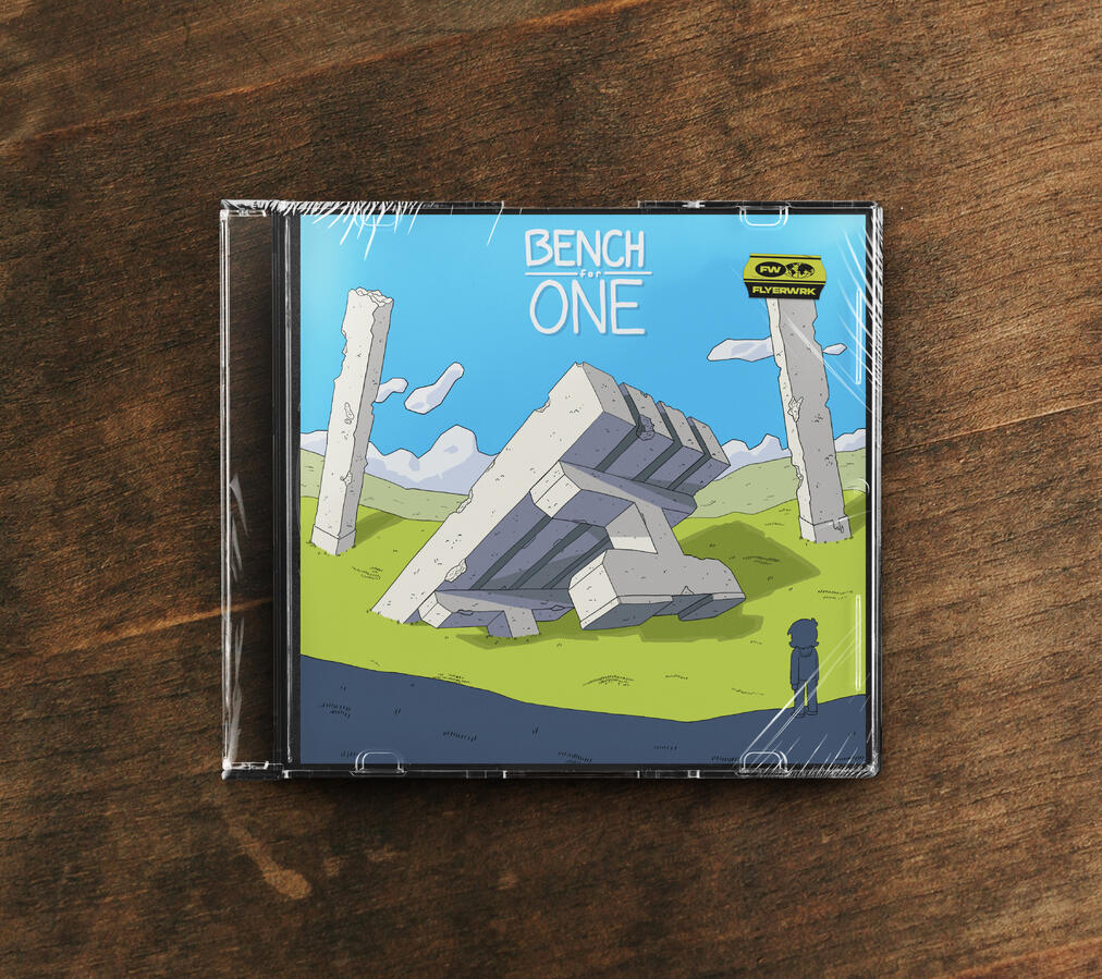
Bench For One | Photoshop

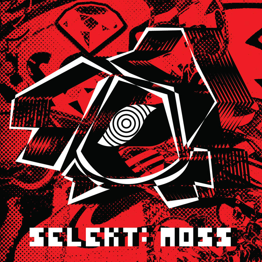
Selekt Moss | Photoshop

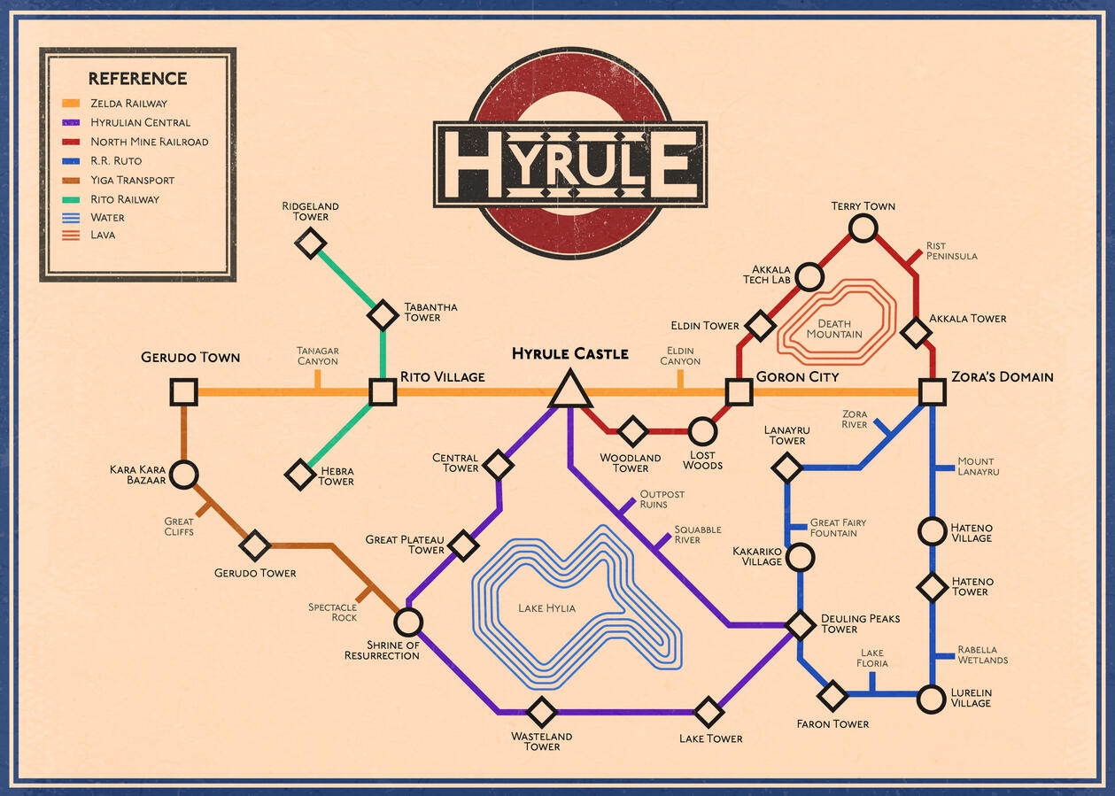
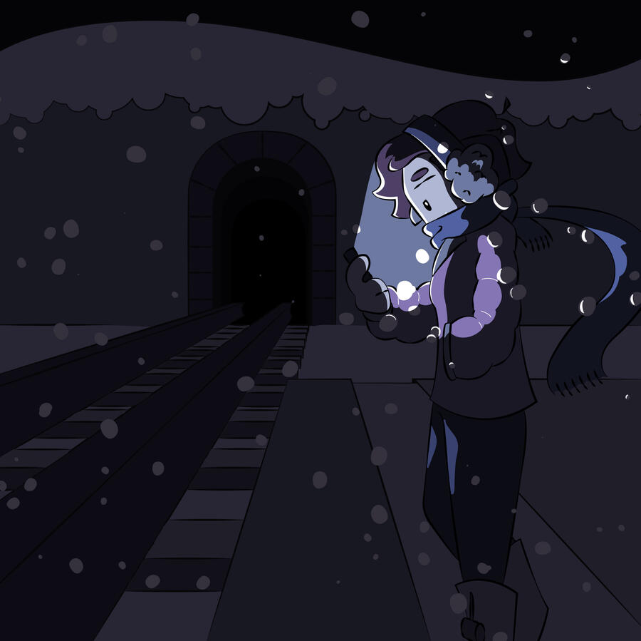
Great Hyrulean Railroad | Illustrator + Photoshop

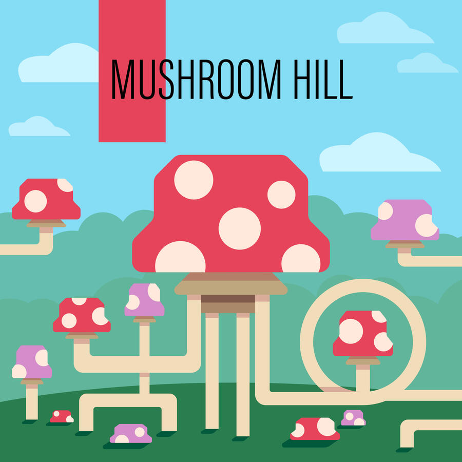
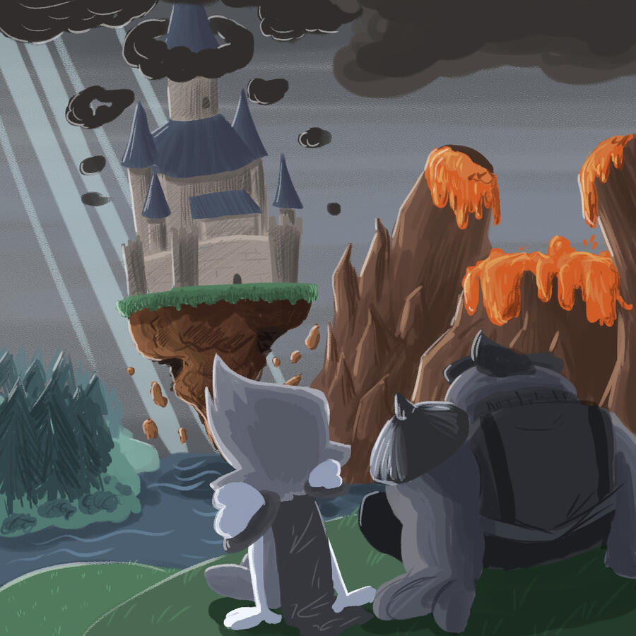
Mushroom Hill | Illustrator

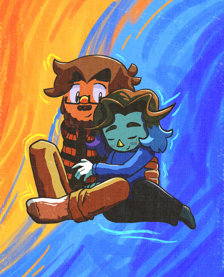
Untitled

Untitled

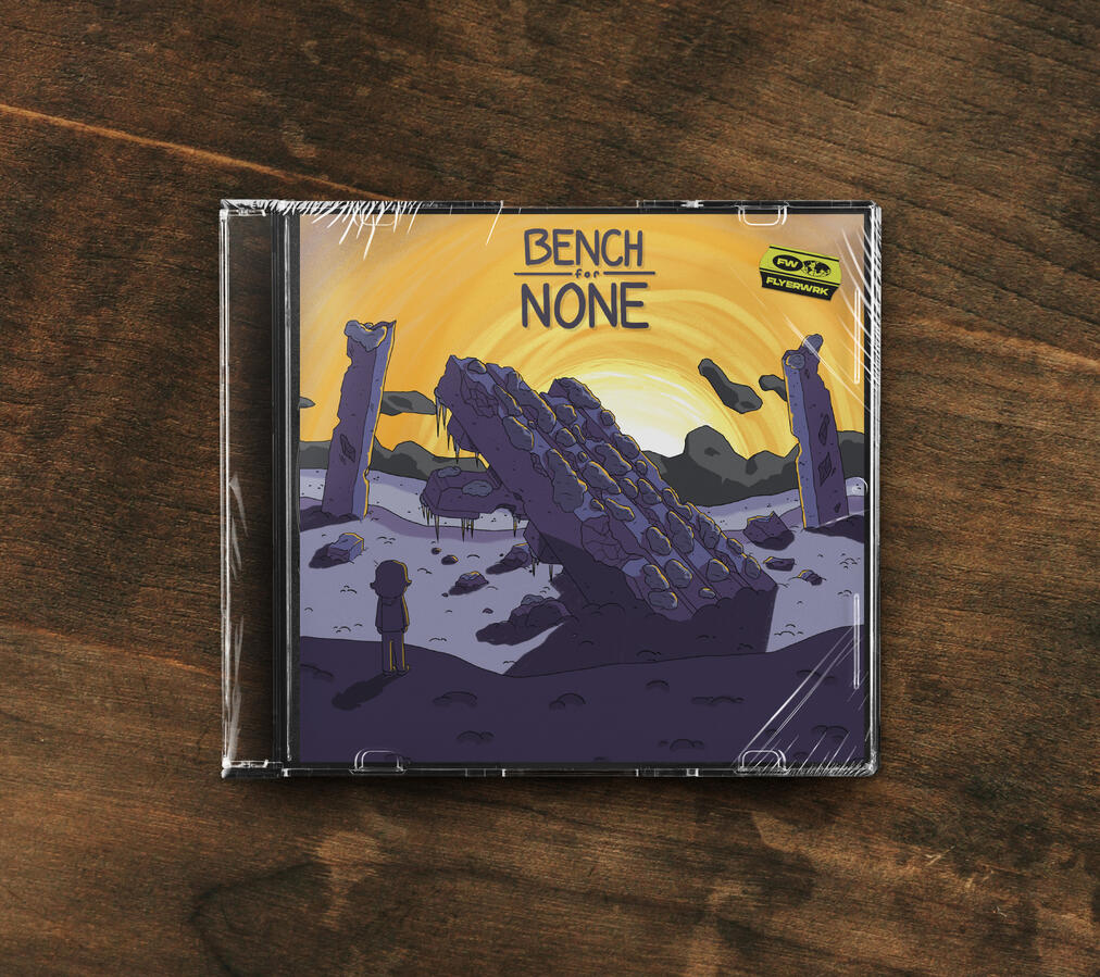
Bench For None | Photoshop

Untitled

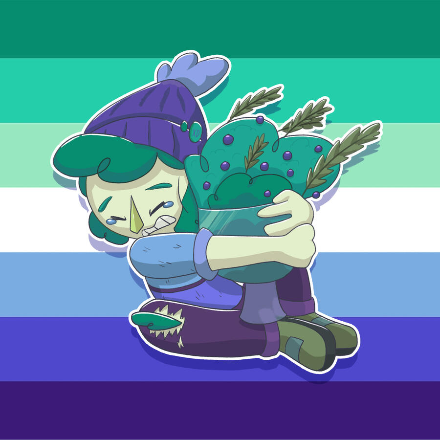
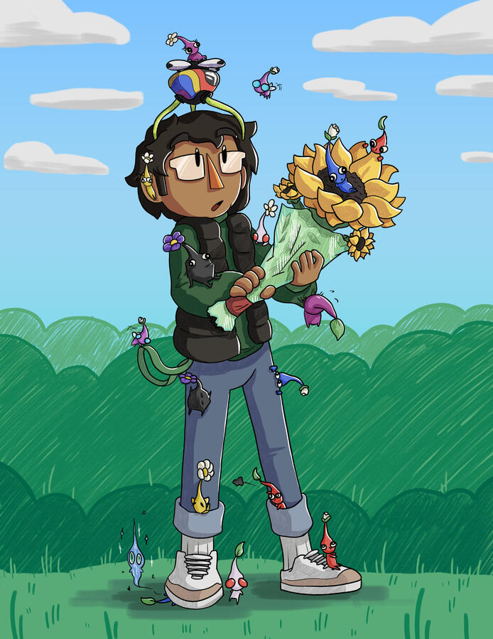
Jopa & His Pikmin | Photoshop

Untitled

Untitled

Untitled

Untitled

Untitled

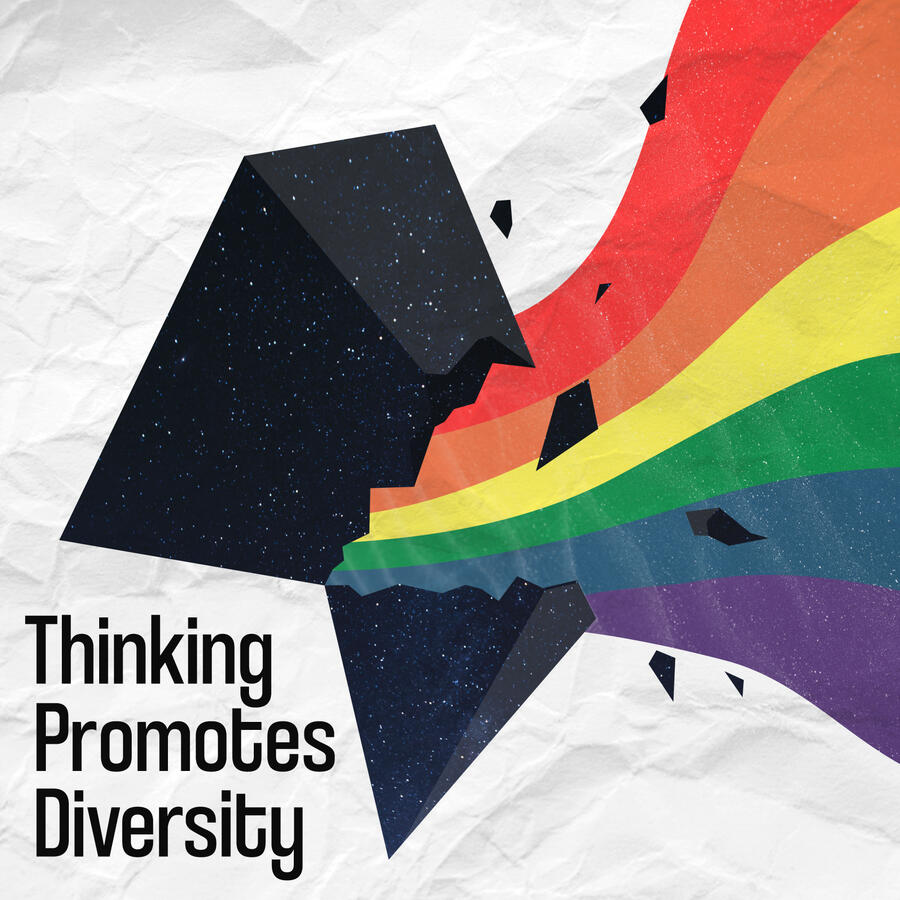
Thinking Promotes Diversity | Illustrator

Discovery | Photoshop

Untitled

We Sepia Now | Photoshop